
Carl-el
Overview
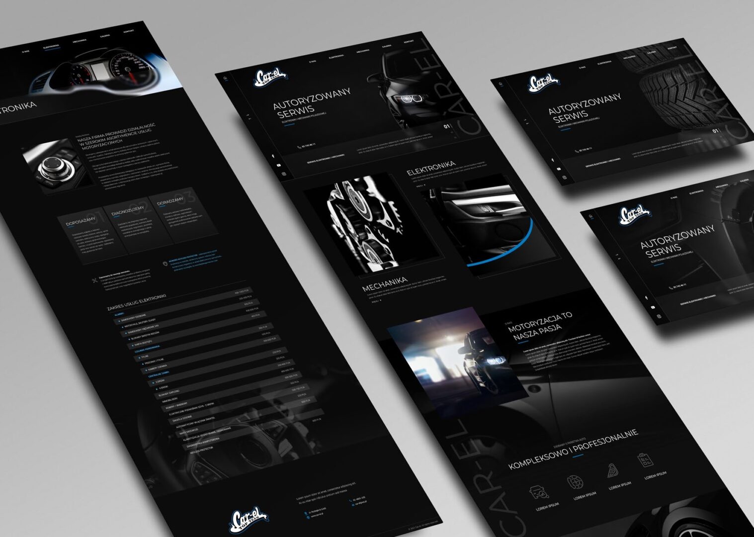
The project focused on designing a modern website for an authorised service centre specialising in vehicle electronics and mechanical repairs. The goal was to create a clear and professional digital presence that communicates expertise, reliability, and a broad range of services. The visual direction is built around a dark, minimalistic aesthetic, where subtle blue accents reinforce the brand identity. The homepage features a simple hero section with prominent contact information and isolated imagery presented on solid dark backgrounds.
Outcome
The final website establishes a strong sense of professionalism and technical precision through its dark, high-contrast visual system. A restrained colour palette, supported by near-desaturated photography and subtle blue highlights, keeps the focus on content while reinforcing brand recognition. Hero slides use isolated visuals on solid dark backgrounds, creating a clean and structured presentation that reflects the precision of automotive diagnostics and repair work.
Service presentation is a core element of the structure. The services subpage is organised in a clear table format, allowing users to quickly scan the full range of offerings, from electronics diagnostics and mechanical repairs to consulting services. This format improves usability and mirrors the systematic nature of the work performed by the service centre.
Overall, the website delivers a modern and trustworthy digital experience aligned with the client’s technical expertise. The combination of minimal layout, strong hierarchy, and disciplined use of colour creates a cohesive platform that clearly communicates both capability and professionalism.
Overview
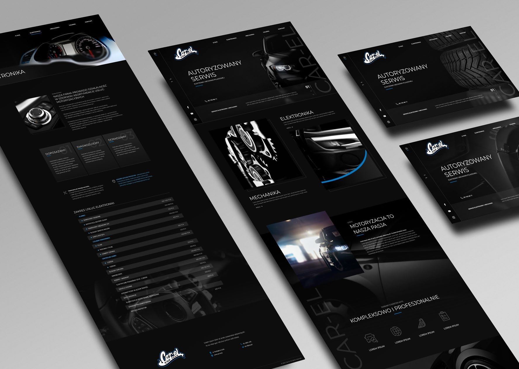
The project focused on designing a modern website for an authorised service centre specialising in vehicle electronics and mechanical repairs. The goal was to create a clear and professional digital presence that communicates expertise, reliability, and a broad range of services. The visual direction is built around a dark, minimalistic aesthetic, where subtle blue accents reinforce the brand identity. The homepage features a simple hero section with prominent contact information and isolated imagery presented on solid dark backgrounds.
Outcome
The final website establishes a strong sense of professionalism and technical precision through its dark, high-contrast visual system. A restrained colour palette, supported by near-desaturated photography and subtle blue highlights, keeps the focus on content while reinforcing brand recognition. Hero slides use isolated visuals on solid dark backgrounds, creating a clean and structured presentation that reflects the precision of automotive diagnostics and repair work.
Service presentation is a core element of the structure. The services subpage is organised in a clear table format, allowing users to quickly scan the full range of offerings, from electronics diagnostics and mechanical repairs to consulting services. This format improves usability and mirrors the systematic nature of the work performed by the service centre.
Overall, the website delivers a modern and trustworthy digital experience aligned with the client’s technical expertise. The combination of minimal layout, strong hierarchy, and disciplined use of colour creates a cohesive platform that clearly communicates both capability and professionalism.
Ready to start?
Reach out to discuss your project and how we can work together